Thursday, June 28, 2012

Fourth of July - part one

Patriotic...exuberant, corny, tasteful?


“I’m a Yankee Doodle Dandy “– flags are sprouting in planters in anticipation of the Fourth of July.  Is it possible to have tasteful Fourth of July designs?  

Or should we just go for the exuberant  or corny?  As Kate Winslet says in “Holiday” “I want corny in my life right now”.   Let’s just avoid the mundane!


Red, white and blue are the colors of 24 of the flags of the world’s countries.  These colors are chosen for their bold ability to stand out and be seen.


Patriotic ...exuberant, corny, tasteful…what is tasteful anyway?  My taste is surely different from yours, my tasteful may be a horror or boring to you.  However since it is my blog……..my taste!  


The secret lies in the proportion of Red, White & Blue.  Somebody has to take a back seat. In the banner above, Which proportion of red to blue to white do you like?


This is a lacquered bamboo (or cane?) container from Target, that most useful of stores.  It stands 24” tall – definitely does not hold water.  Don’t you love the color?  Originally bought for a Christmas design, this is a bold red for the 4th.  To hold the hydrangeas, a plastic container lid is placed across the top of the vase,  with oasis on top of it.  With painted blue bamboo stakes,  a patriotic statement on the front step, well, maybe a little too tasteful, ie., boring, or worse at little FDT (that devastating critique)?


Adding visual fireworks in the form of sparking wired flags and navy blue painted dried Allium christophii.  These exuberant seed heads are almost more versatile dried than when they spark the June garden with fresh lavender fireworks.


Crafted a couple of years ago, the same Target container was ‘upholstered’ in various hand-made papers, mostly in blues, using Modge Podge, a collage (a waterbased sealer, glue and finish).  A froth of double baby's breath is reflected in the mirror.  A necklace of carnation buds adds a touch of red.  The baby's breath is really in water in a jerry-rigged pile of plastic containers!


Using the same mechanics (oasis on a plastic lid), this modern mass (see "The Pastels of June") uses  clockwise from 1PM blue trachelium, dark rich red carnations, white hydrangea,three artichoke flowers baby's breath and, last, peeping out brighter red carnations.  The container is definitely an element in the proportion keeping the blues, which tend to recede, dominant. 


The artichoke flowers come on long fairly thick and tough stems, to keep them in place, a skewer is used to act as a kind of fulcrum without having to put a longer piece of stem in the oasis. Two skewers are always better than one, but it was worth my life to even get one in the tough and prickly critter so I left it at that.


To be sure that I didn't get too far away from corny, a metallic flag/star wire winds through the design! From Michael's at $.79, surely I could have bought some more......

All these flowers, except the artichoke, are available at the supermarket when you pick up the hot dogs and hamburgers, don’t forget the relish!

Cheers and part 2 on Sunday...

Sunday, June 24, 2012

Summer afternoon


 Garden party...


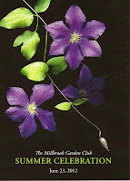
In “A Backward Glance” (1934), Edith Wharton quoted Henry James: “Summer afternoon,..summer afternoon; to me those have been the most beautiful words in the English language”.   Given that Henry lived those afternoons in England, that might have been a bit of stretch!  But what a lovely thought!  We probably have more consistent beautiful afternoons here in the Berkshires.  Garden parties on summer afternoons are two lovely thoughts. We had both for real for our garden club yesterday.  The late afternoon sun streaked across the lawns of our gracious hosts’ lovely home as the guests arrived. 
  
She is a renowed grower, plantswoman and GCA horticultural judge.  No surprise then that her gardens are breath-taking with handsome mature trees, lovely stonework and gorgeous plantings.  Originally designed by the Olmstead firm, they have evolved handsomely with their present owners and were much admired as guests strolled around, prosecco in hand. 

Rather gilding the lily here, various arrangements in the house, summer house and party tent used peonies, gladiola, high bush cranberry, lilies, lisianthus  plus more wonderful home grown cuttings of oak leaf hydrangea, on-the-way-to-dried allium seed heads, curly onion.


The dream headquarters of this operation turned the original butler’s pantry into the flower room for the day.  The table holds some of the many containers used on the bars, reception table, & mantle.


Beautiful verdigris copper urns were filled with oak-leaf hydrangea, allium, & white lisianthus – what someone called “those florist flowers, you know”, to Latin-lovers Eustoma russelionum.  By any name not my favorites. 


To keep them in place in the V shaped container, which would not hold a pinholder, I used the dried allium stems crossed just above the water level – an ikebana trick known as a kubari.


On the mantle, keeping these beautiful blue and white containers as the stars, only the cranberry was used in a cluster.  These containers do not hold water, so a plastic bag was put in first, filled with water.  The branches were wired in bouquet, slipped in and the plastic tucked in so not to show.


Home grown peonies and lilies in the corner of the same room show off gorgeous ceramics.


For the reception table, two charming ceramic creatures were used together – a snail and a hippo.  Filled with pink peonies, swirly onion, more cranberry, and..  The hostess and I thought the gardeners checking in would recognize our nod to the record crops of slugs in our gardens this month!

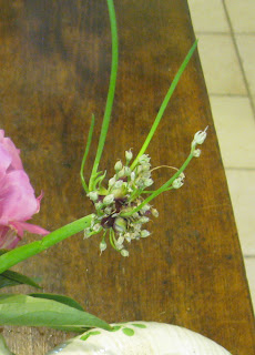
 This is Allium proliferum, Egyptian walking onion - adds wit and fun (and well, maybe a tiny, little smell) to the flowers.


A beautiful begonia in the summer house, where a rooster with an amsonia tail sat on the soon-to-be bar table. 

 With all this, however,  the gardens and the guests were the stars of the evening!  Cheers!

Wednesday, June 20, 2012

Multiples make more

Summer marches down the table....


After renovating old dairy barns twelve years ago, we started collecting pint and half pint milk/cream bottles.  Since then, these regularly march down the center of our dining table filled with seasonal flowers. This time of year our dirt roadsides offer a multitude of blooms to choose from and they are FREE!  Talk about sourcing locally!


This group of flowers are blooming on our roadsides now. Ferns, dock, daisies, and what I call cow parsley - the green Queen Anne's lace-looking plant - blooming above on the road side with a flat dill-like flower head and chervil-like leaves.  What is it?


  Multiples of inexpensive and recyled containers such as these can cover a large space requiring only a few flowers and creating a great impact.  


 Here pint and half-pint bottles march down a light green linen runner.  I don't worry about the height of these arrangements as we don't use this table in the summer.  It becomes a great staging place for all sorts of designs.


The eagle-eyed will spot the feverfew (smaller clustered daisy flowers) which I rip out of my front garden every week.  They are a pleasant flower, seed in prolifically and bloom much of the summer.  However they are a constant reminder to me that I wanted double feverfew, darker leaves and a double bloom with no yellow center.  I am determined that they will disappear this season!


Any variation you make can tell a different story.  
On a twig runner, they look even more rustic country.  I use this runner from many seasons ago at Crate & Barrel often.  It has a neutral color and great texture, especially on this table which is made from recycled floor planks from our barn, and includes several different woods including oak and tiger maple.  

Happy first (hot) day of summer & Cheers!


Monday, June 18, 2012

The pastels of June

Easy modern designs

June, moon, spoon ran the old song, and pastel shades flood the gardens, flower stands, and flower markets.  Last week four students came to The Barns to create modern mass arrangements.  These contemporary designs are not your mother’s mass arrangements.  These focus on a strong container and bold blocks of color and texture.  Butterflies and bees would be harmed trying to fly through these designs! 


Materials were chosen because they offered contrasts of textures – shiny vegetables, lush bold peonies, feminine roses played against the floriferous busyness of hydrangea, the dark sheen of galax leaves.


In the demonstration design above, you see that the materials are kept in groups placed next to each other, rather than an open (those birds and butterflies again!) interspersed placement.  The solidity and boldness of the groupings balance the height and heft of the container, which is an important element of the design.

As with most things, the design reveals itself by the doing of it.  For first timers, there is a give and take to get the design to take shape.  It is fun to watch the moment when you can literally see the student ‘get it’ and start to have fun with it.  The simple verdigris 'copper' container – rather like a beaker – was filled with material (see cross section) and a shaped block of oasis put on the top.  It should sit well above the top edge of the container so stems may be placed at an angle.  The oasis can be taped to the container to keep it in place.  However I find either the tape is just where I want to put a stem or it shows on the container. Instead we used kitchen skewers, poked through the hydrated oasis into the oasis pieces that we used to fill the container.  Because the arrangement will be top-heavy, ‘ballast’ in the form of hydrated oasis, stones, gravel or sand will keep it from toppling over.

The angled materials disguise the rim so container becomes a seamless element of the whole design. The materials were purple allium, lavendar spider mums, crème de la crème roses, green peppers, celosia (the marvelous green brain coral looking material), hydrangea and galax leaves.  The visual weight of the massed materials balances the height of the container. 


Although all the materials supplied were the same, notice how different each one is. They did not have to use all the materials but most did.  To water the design, slip ice cubes between the stems at the top, they will melt into the oasis keeping it hydrated. 


Every kind of material is grist for the mill of this design.  The one above is simpler and made from the supermarket, in a slightly smaller container from Michael's.  This ceramic container is heavier so no need for so much 'ballast'.  I just plopped the oasis on the top.   Bunches of 3 peonies, 3 spider mums, 6 carnations plus 6 jalapeno peppers.  Happy designing….

Cheers!

Sunday, June 17, 2012

Beginning with a wedding


33112

Double numbers, double happiness for this wedding date – March 31, 2012.

Cast: A bride who knows what she likes, a MOB (mother-of-the-bride) who is a floral designer, and a super creative florist = a happy combination.

The bride chose royal purple with touches of red-orange as her colors.  Inspired by “ Wedding Emotions”, a wonderful wedding flower book by my friends at Life3 (Stichting Kunstboek, 2005), she highlighted purple vanda orchids, orange mokara orchids and constructions out of wire.  The MOB, thrilled that there would be no gawky stemmed bouquets (a particular dislike), tried out a wire-construction and went off with it to Sprout, Worcester’s great florist.

Cathy Walsh and her team ran with the idea and an idyllic cascade was born!  And as with any great designer, she ramped it up and made it her own.  Filled with purple vandas, spotted orange Singapore orchids, hellebores, and tulips, looped basket cane and lily turf grass carried the line of the exuberant bouquet.  It slipped over the hand like a muff.


The bridesmaids wore purple dresses of their own choice and carried bouquets in which the scheme was reversed. Again no bunches of stems, but a swirled design in which the stems looped in and around the bouquet in various oranges of protea, ranunculus, strung hypericum berries, and tulips with deep purple moonstone carnations. 


 Boutonnieres carried it one step further, with ranunculus stems wrapped in orange yarn with purple wire, ending in a hypericum berry - all playing off the purple ties given to the wedding party.


What fun to see a vision come together and play out! Lots more on the wedding on the Sprout blog.  A milestone to celebrate and share.  


Thanks to a Worcester friend, I have a copy of WORCESTER Living, Summer 2012, with the bridesmaid's bouquet on the cover and the bride's bouquet inside.  How cool is that?


Cheers!